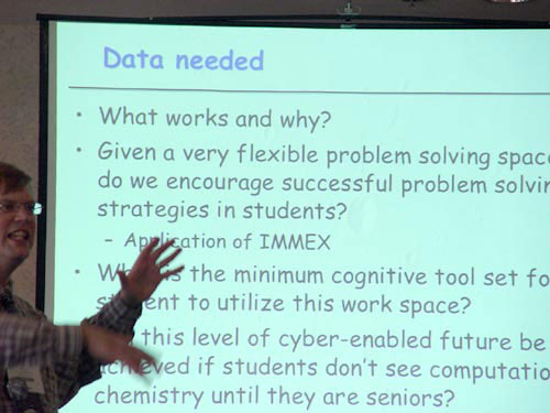
Yup. I said it. Your PowerPoint sucks. It’s ineffective, it’s long, and it uses a stock template with a lame name like “Solar Flare” or “Dad’s Tie.” It’s full of meaningless jargon, bullet points, and confusing diagrams.
If that sounds harsh, take solace in this fact: you’re not alone. PowerPoint has become a ubiquitous tool in the corporate space, and most of the time, it’s used poorly. For my day job, I work as a video editor and motion designer in the world of corporate video–a land where bland, empty buzz-speak is recited as gospel. And, worst of all, PowerPoint presentations have become the goto method to lazily convey messages that eventually end up in the videos I’m asked to make.
You see, for a long while I used to think I completely hated PowerPoint. I thought all these bad presentations I kept on running across were somehow Microsoft’s fault–that Bill Gates was punishing the rest of the world because he got picked on during fourth grade recess. Well, as it turns out, I don’t actually dislike PowerPoint at all. No, I just hate when it’s used incorrectly.
To put this into perspective, I think it’s helpful to understand what PowerPoint is not. It is not a word processor. It’s not a graphics program. It’s not an illustration program or desktop publisher. Heck, it’s not a photo storage program (stop sending me .jpg images embedded in a PowerPoint. Please!). This may come as a shock, but PowerPoint is a presentation program. It’s meant to convey information to an audience. More specifically, it’s not meant to produce passive documents that can just be sent to someone via e-mail and consumed without an accompanying narrative. Ah, narrative! Therein lies the true crux of the matter. Most PowerPoints suck because users stuff them full of content and bullet points, but somehow fail to tell an engaging story in the process.
As a filmmaker, I firmly believe storytelling is everything, and PowerPoint should be approached no differently. It should help tell your narrative, whether it be at a generic staff meeting or some bigwig pitch. It should evoke emotion and engagement from your audience. Before you start a presentation, determine the story you want to tell and use PowerPoint to help convey it. The key word here is help. PowerPoint should support your presentation, not drive it. Never should you read straight from a PowerPoint slide. After all, if your message can be related without your help, what’s the point of even being there in the first place? The big screen behind you shouldn’t be driving the presentation…you should.

And, it even uses Comic Sans...*Tsk* *Tsk*
So, how do you do this? Simple. Use less words. Say more. Type less. The worst PowerPoint offenders consist of slides filled with lots of words that ultimately add up to say nothing. The program itself subliminally contributes to the problem by having all those pretty template pages ready to go on the side of the application, just begging for you to use them–you know, the ones with bullets and sub-bullets, and sub-sub-bullets. Frankly, if an idea is so complex that it requires sub bullet points you shouldn’t be presenting it as a PowerPoint slide. When you are coming up with content, think: “what’s the shortest way I can say this? What’s the least amount of words I can use?” Avoid full sentences. Try to only use 10 words per slide; a simple phrase will do. Also, avoid clip art and cheesy animation effects. It makes you look like you’re five.
But now you’re probably asking, what about all that super duper, really important stuff I need to say? Well, quite frankly, it’s probably not that important. Sorry. Your audience isn’t going to remember the nitty-gritty of your presentation. If you’re lucky, they will remember about 20% of the content. They will remember, however, if you were boring. Keep it brief. Instead of stuffing tons of facts and figures in your slides, hand out a fact-sheet (built in a word processor!) that has all that meticulous information in there. After all, a simple clean piece of paper with text, is infinitely more accessible than 20 pages of printed out, impossible to read PowerPoint slide thumbnails.
Okay…okay…as I continue to ramble on, the irony of promoting the importance of brevity through a long-winded blog post is not lost on me. So, I’ll wrap this up. If I leave you with one lasting image, let it be this: at this very moment countless people are sitting bored and lifeless in a meeting. They are completely unengaged as they watch a speaker read text filled slides verbatim from a information loaded but content lacking PowerPoint. This could have been avoided.
And, frankly, that just sucks.
